M City Condos
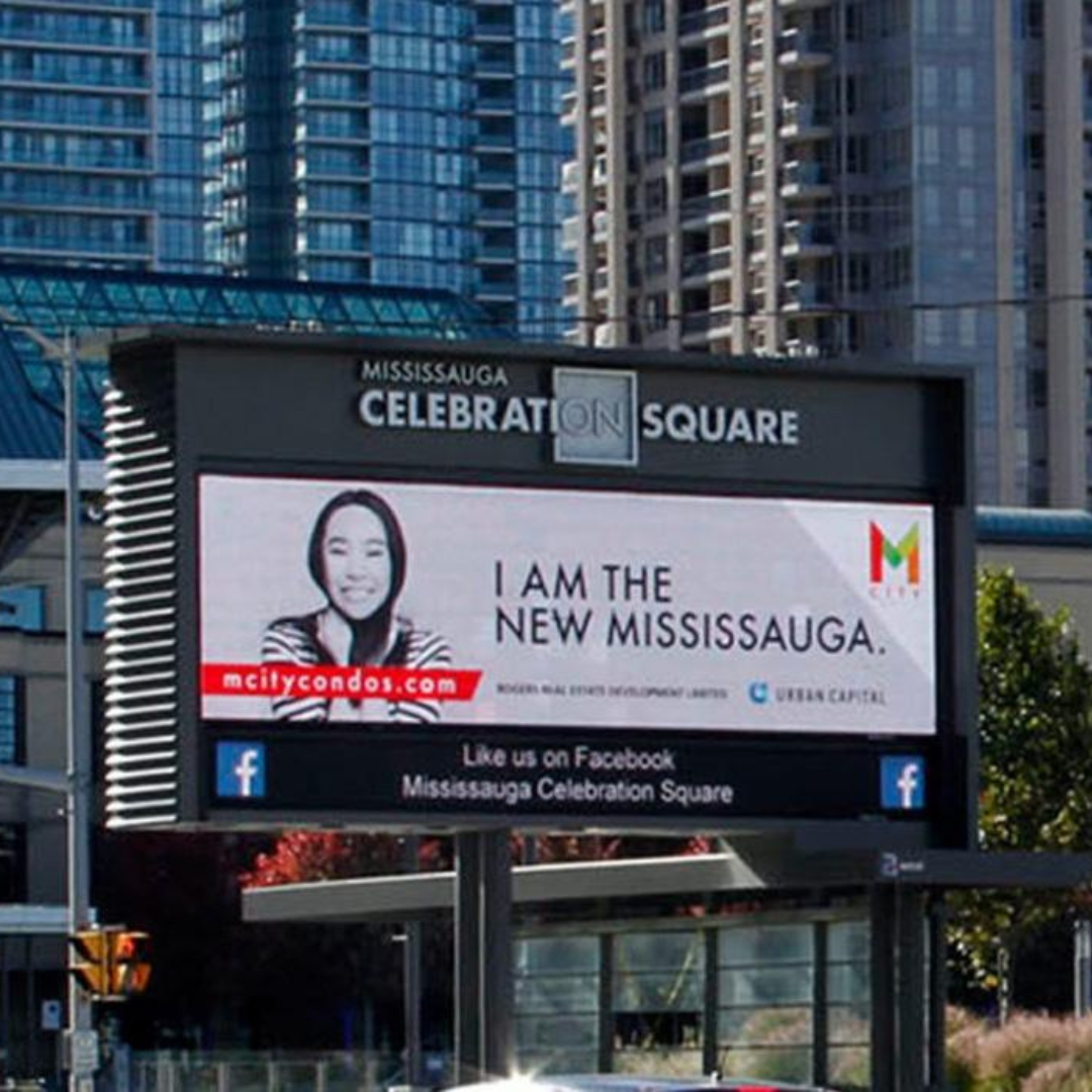
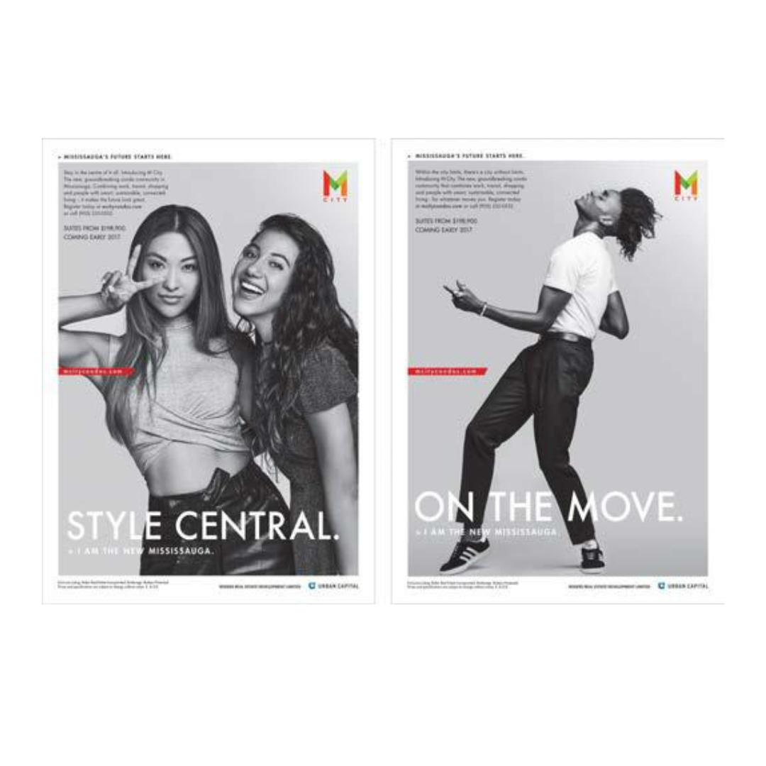
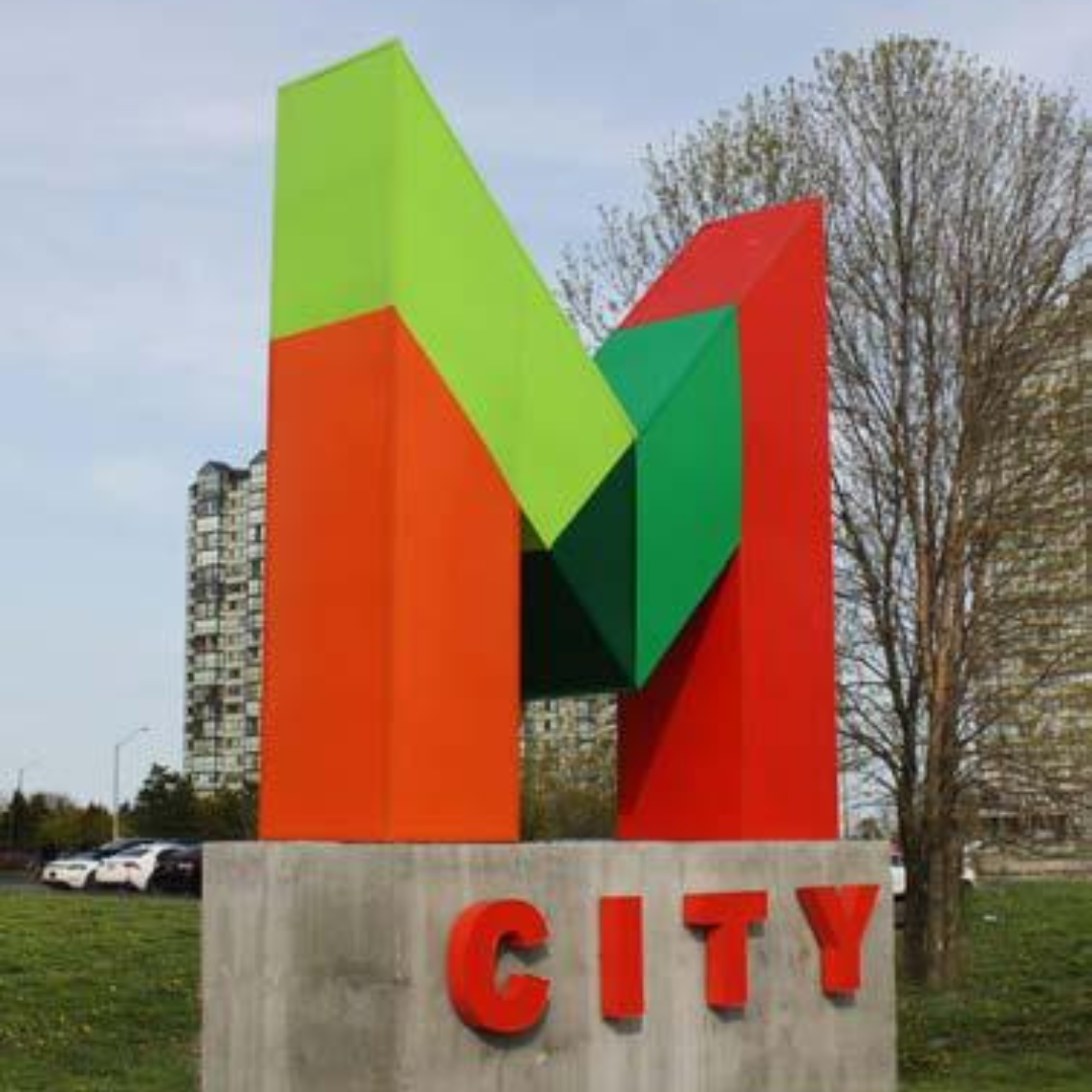
I worked on the campaign and marketing materials for new condos to be launched in Mississauga’s hottest new area! The multi-coloured identity was designed to represent the city’s cultural and demographic diversity and, quite frankly, stand out among the crowd of competitive projects. A 24ft high back-lit sign marks the location of the presentation centre and both traditional and online media executions were created that focused on the market’s diversity. including signage, sales centre design, print, digital and brochures.